Deep Ink
A responsive web app helping tattoo customers design unregrettable tattoos.

My Roles
- Researcher
- UX Designer
- UI Designer
Tools
- Adobe XD
- Optimal Workshop
- Usability Hub
- Google Sheets
- Pen & Paper
- MindMup
- Keynote
Duration
6 months
6 months
A massive 36% of 18–25 year olds and 40% of 26–40 year olds in the U.S. have at least one tattoo. Yet, a surprising 17% of tattoo owners feel some regret.
Design a responsive web app that reduces regret for tattoo customers.

I began my research with a competitor analysis, getting familiar with what products might be offering solutions to tattoo regret. I conducted a UX analysis of Tattoodoo and Ink Hunter, evaluating their usability based on their advertised primary features.


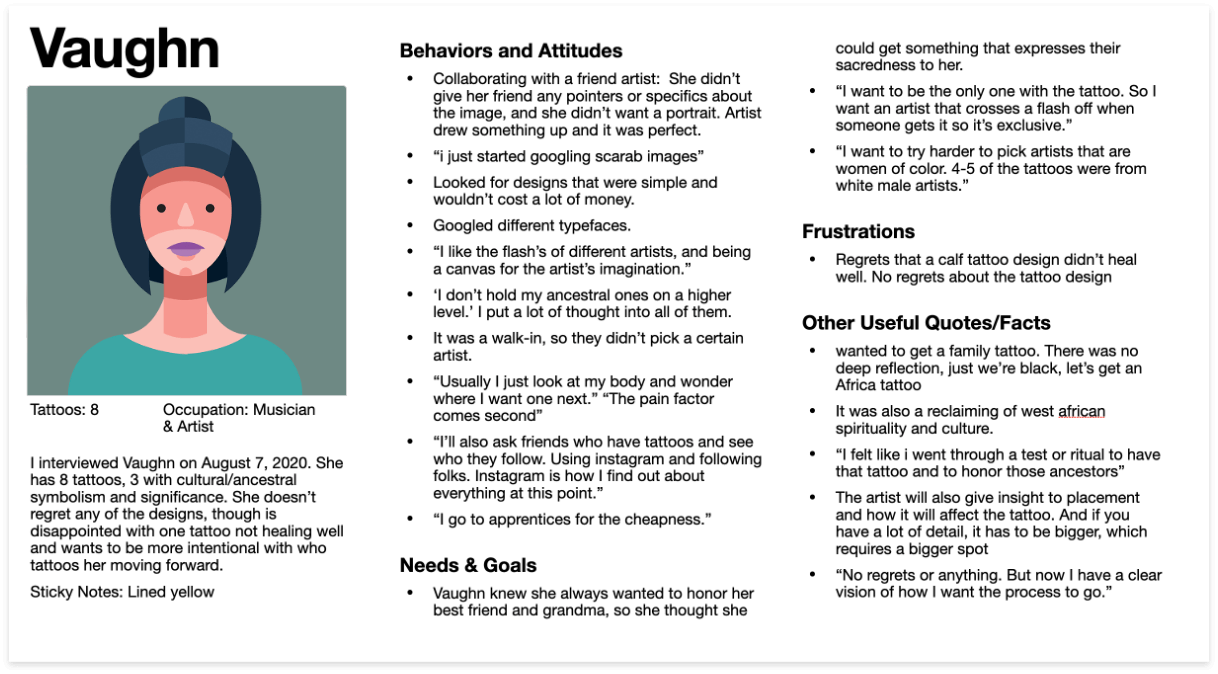
I conducted 5 interviews to better understand the problem space. This involved identifying customer needs, context, pain points. Analyzing this data would help me glean insights into solutions.

I made a profile of each interviewee, organizing and consolidating my notes into four categories: Behaviors & Attitudes, Needs & Goals, Frustrations, and Useful Quotes/Facts.
I created affinity maps to find themes in the qualitative data and gain insight into possible product features.

I was surprised to learn how much tattoos can change after healing. I created a survey to discover more about this frustration among tattoo customers.
I recruited participants through social media, screening for individuals 18-50 years old with tattoos. 69 people participated in my survey. Though this is not a large enough sample for statistical significance in the tattoo industry, the results gave me a clearer view into my interview insights.
Wow! Tattoo customers really could use support in their tattoo color choices.
50% of tattoo customers surveyed have received conflicting information about how ink colors interact with skin tones.

Research data enabled me to narrow the problem space and begin ideating design solutions. My new working problem statement became:
Tattoo customers need a way to more accurately predict how their tattoo will look after healing, a way to research cultural iconography without feeling overwhelm, and a way to filter images more for their needs.
Before designing solutions, I wanted to make some quick visual references to my research data and insights. These references would remind me of the user needs and context while designing, and help me maintain empathy for them.
I created two personas by combining data and quotes from my interviews and survey. They included goals and needs, motivations, frustrations, notable interview quotes, and more.

Journey Maps visually displayed the research insights in a narrative form. They also broke down certain user goals into their smallest steps, highlighting the emotional journey along the way, as well as any opportunities for product features that could support them.

Based on the personas and their journies, I derived key user objectives and executed task analyses. Those analyses were then turned into user flows to map all the possible page interactions a visitor might have on the way to their goal.

I was now able to take these user flows and create an initial site map with a navigational structure appropriate for our users. I decided to use a strict hierarchy navigational structure, because the primary features don’t need to connect.
To validate my site map’s structure and organization, I created an open card sort on OptimalWorkshop and recruited 5 participants. I used Optimal Workshop’s Similarity matrix to find patterns within this small data set.
Key learnings were applied to create site map version 2. Changes made based on the card sort are in RED.


Now that I had the high-level architecture drawn, and primary features ideated to support the user journeys, I could begin designing wire-frames and prototypes.
Initial Design Goals:
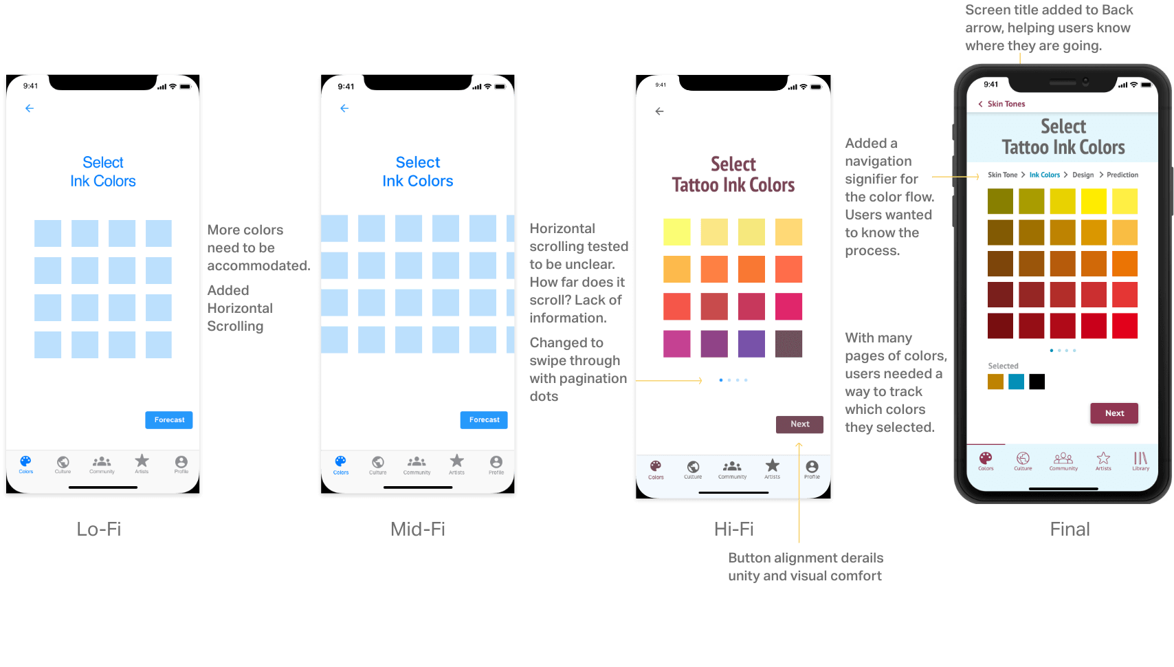
I began sketching lo-fi wireframes and prototypes using pencil and paper to convey the high level user experience. This helped visualize the user flow in screens, and get the basic navigation and button requirements.

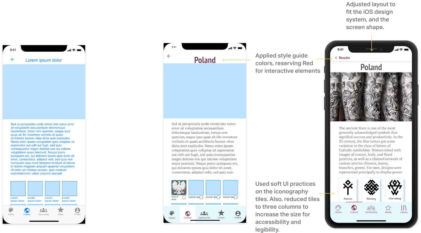
I created mid- then hi-fidelity clickable prototypes, incorporating more detail each iteration, yet still saving a lot of the copy, images, design system colors for later. The allowed me to focus on usability.

To validate the design decisions in my prototypes thus far, I conducted usability tests. I recruited 6 participants from my personal network, screening to match basic target user criteria (age, tattoos). Each test involved basic demographics, scenario tasks, and follow-up questions.

I created an affinity map to organize the test session insights. Insights were consolidated into a rainbow spreadsheet, allowing me to visualize the data and prioritize the top 5 usability issues.


Test participants were often confused and misled by the onboarding screens. I simplified and distilled the on-boarding graphics, decreasing the cognitive load and better informing the user.

Participants were uncertain how their color prediction would display. I added sample design options to the color prediction flow, empowering the user and informing them what to expect in a prediction. Now users could anticipate and have some control over the display of their color predictions.


Deep Ink was a fabulous project to work on. I dicovered some real clear user needs and product opportunities in the tattoo market.
The idea for the color prediction flow was inspired by an interview with a tattoo artist in Portland, OR, following my user interviews. He believed it could work and the estimates could be precise enough to be helful.
If the goal had been to fully ship this product, I would needed some addtional research and a slightly different process:


Interested in my work? Let's talk! I'm based in Portland, OR, and work remotely as well. Email is my preferred method to start a conversation.
Email Me